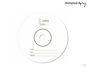
3.1 BRANDING LUMIS
February 28, 2013 by Brian Lewis
Over the years of practice as an architect I have come to the realization that my brand is my reputation and that everything I am is my brand. When I decided to launch into architectural photography as a formal business I decided that it would be a good idea to seek advice and turned to Gareth Jenkins of the Abovegroup Ogilvy [AGO] who had worked with our architectural firm, ACLA:WORKS, over the years. My personal philosophy in life is that “if it is worth doing, then do it well and with style” and so I decided to invest in AGO to help me develop my brand. With limited space available and respecting your time to read this I will just outline the preliminary stages of the Branding and Brand Assessment.
What was striking was the number of young people involved in the process; each handling different aspects as members of a team as we progressed through an ordered process beginning with a thorough understanding of me, the business, the industry and the market. With this background in place AGO then begun a complex analytical process of deriving a ‘proposition matrix’ involving ‘descriptors’, ‘product, personal and auxiliary value sets’. The conclusion is the Core Proposition: “Nothing Overlooked”.
The Brand Name was a separate stage involving a study of the related vernaculars of architecture and photography, exploring suitable naming options through linguistic and creative exercises and finally ensuring compatibility with the brand-positioning platform. Of the five names created, LUMIS was selected. The names derives from the word ‘lumen’ – a unit of luminous flux and is strongly associated with ‘light’ – the essence of both architecture and photography.
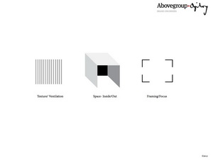
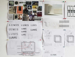
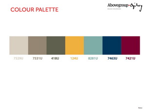
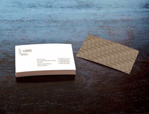
Armed with a name and a core proposition it was time to look at the brand identity. This stage involved a creative process that looked at architecture, photography, colour, patterns and forms and finally evolves a logo, word mark and a complete range of brand property.
With a complete graphic vocabulary the next major task was to design a website. This turned out to be a major challenge for both AGO and for me since it involved a series of compromises. I wanted images that would be the 1:1.33 proportion of the Hasselblad 50 Mp camera sensor because it seemed to me to be a compromise to crop images. As it turns out I had to accept a 1:1.5 proportion. The website is clean and simple and is an extension of the brand identity developed for LUMIS.
I would just like to end this blog by congratulating the Above Ogilvy Group for their work and for rising to meet the challenges of the web site design.
